Articles

February. 11, 2026, 12:11 PM PST
By: Navya Chopra
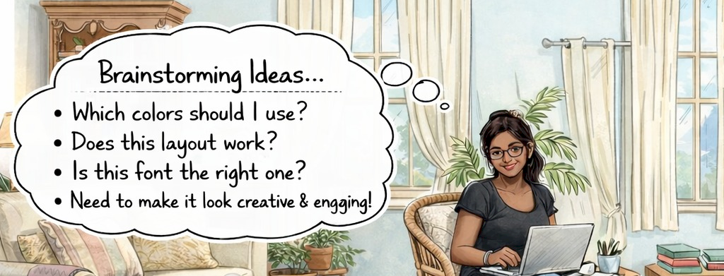
There is a strange phenomenon happening in today's digital product world. Interfaces have never looked better, yet users have never been more frustrated. Designers have become extremely good at what is visible: spacing, color, typography, and visual hierarchy. By visual hierarchy, I mean how clearly a screen communicates what matters most and what should be noticed first. On the surface, many products feel polished and complete. At the same time, however, we have become worse at designing the parts of the experience that users do not immediately see: the logic, structure, and how decisions unfold.
What problem are you solving? What product or service are you creating? Articulate your vision in a way that is concise, compelling, and resonates with your target audience. Think of it as the enticing aroma wafting from a fresh-baked pie: it draws people in and makes them curious for more.
There is a common assumption that a designer's main contribution to a digital product is the screen itself. In other words, many people believe design begins and ends with what users see. In reality, professional product design is far more nuanced. Good design is not just about solving a visual problem; it is a way of thinking about how people interact with systems. It is a discipline that shapes how a product behaves, how it guides users, and how it responds when things go wrong. If we want digital products to survive in an increasingly competitive market, we need to rethink our approach. The interface is not the work itself: it is the final result of decisions grounded in human behaviour and business goals.
When I look at modern products today, I don't see a lack of effort or skill. The people designing these products are clearly capable and talented. They know how to create clean, modern, visually appealing interfaces. The problem is not visual quality. The problem is that users don't interact only with what they see on the screen. They also interact with the decisions the product asks them to make. Every button, confirmation, and transition represents a choice. When those choices are unclear or poorly sequenced, visual polish alone cannot prevent frustration.
Over time, I've learned that user frustration rarely comes from the interface's appearance. It comes from how the product behaves when users are uncertain, distracted, or moving too quickly. Real people do not use products in ideal conditions. They skim content, rely on habits, and make decisions with limited attention. When I say people operate on habit, I mean they click based on patterns they've learned rather than careful reading. Regardless of how good a product looks, users expect it to support them even when they are not fully focused. When a product assumes perfect attention and perfect understanding, it fails real-world use.
This is where design is often misunderstood. Design is not about removing every barrier in the name of efficiency. Efficiency, in this context, means how quickly a user can complete a task. While speed can be helpful, it is not always the goal. Design is about knowing when guidance is necessary. Many products are optimized so heavily for speed that they remove moments of thinking altogether. In trying to simplify the experience, they shift responsibility onto the user and label it simplicity. When something goes wrong, the product offers no warning, no support, and no way to recover.
This brings me to friction. By friction, I mean any moment where a product intentionally slows a user down, such as a confirmation step, a warning, or an extra decision before an irreversible action. From my perspective, friction itself is not the problem. Poorly designed friction is. Friction that comes from unclear structure, confusing flows, or unnecessary complexity frustrates users and should be removed. But the friction that is placed intentionally serves a different purpose. When friction appears before a risky or irreversible action, it protects the user. It slows them down just enough to ensure their action matches their intent.
This understanding has changed how I evaluate products. I no longer judge them by how fast I can move through a flow. Instead, I pay attention to how the product supports me when I hesitate. Does it give me context at the right moment? By context, I mean clear information about what will happen next and why it matters. Does it allow me to correct a mistake? Does it help me slow down when the consequences are serious? These are not visual questions. They are structural questions about how the system is designed.
This shift has also changed how I approach my own work as a designer. I no longer start with the interface. I now see the interface as a surface-level outcome of deeper thinking. The interface is not the real work; it reflects how well user behaviour, intent, and risk have been considered. The real design work happens earlier, when flows are defined, constraints are set, and edge case situations where things can go wrong are thought through.
From where I stand today, I no longer believe the most important question is whether we are designing beautiful interfaces. Visual quality is expected. The more important question is whether we are designing for how people actually behave. When we treat design as a purely visual exercise, we end up creating attractive products that frustrate users. But when we treat design as a structural discipline, we can build systems that genuinely support people in the moments that matter most.
That is where the logic of friction lives. It is not about slowing users down unnecessarily. It is about understanding when speed becomes harmful and when restraint builds trust. When this logic is applied well, users rarely notice it at all. The best design is not seen. It simply works quietly, reliably, and in the background.
The logic of Friction: Why the best design is often invisible.

February. 11, 2026, 12:11 PM PST
By: Navya Chopra
There is a strange phenomenon happening in today's digital product world. Interfaces have never looked better, yet users have never been more frustrated. Designers have become extremely good at what is visible: spacing, color, typography, and visual hierarchy. By visual hierarchy, I mean how clearly a screen communicates what matters most and what should be noticed first. On the surface, many products feel polished and complete. At the same time, however, we have become worse at designing the parts of the experience that users do not immediately see: the logic, structure, and how decisions unfold.
What problem are you solving? What product or service are you creating? Articulate your vision in a way that is concise, compelling, and resonates with your target audience. Think of it as the enticing aroma wafting from a fresh-baked pie: it draws people in and makes them curious for more.
There is a common assumption that a designer's main contribution to a digital product is the screen itself. In other words, many people believe design begins and ends with what users see. In reality, professional product design is far more nuanced. Good design is not just about solving a visual problem; it is a way of thinking about how people interact with systems. It is a discipline that shapes how a product behaves, how it guides users, and how it responds when things go wrong. If we want digital products to survive in an increasingly competitive market, we need to rethink our approach. The interface is not the work itself: it is the final result of decisions grounded in human behaviour and business goals.
When I look at modern products today, I don't see a lack of effort or skill. The people designing these products are clearly capable and talented. They know how to create clean, modern, visually appealing interfaces. The problem is not visual quality. The problem is that users don't interact only with what they see on the screen. They also interact with the decisions the product asks them to make. Every button, confirmation, and transition represents a choice. When those choices are unclear or poorly sequenced, visual polish alone cannot prevent frustration.
Over time, I've learned that user frustration rarely comes from the interface's appearance. It comes from how the product behaves when users are uncertain, distracted, or moving too quickly. Real people do not use products in ideal conditions. They skim content, rely on habits, and make decisions with limited attention. When I say people operate on habit, I mean they click based on patterns they've learned rather than careful reading. Regardless of how good a product looks, users expect it to support them even when they are not fully focused. When a product assumes perfect attention and perfect understanding, it fails real-world use.
This is where design is often misunderstood. Design is not about removing every barrier in the name of efficiency. Efficiency, in this context, means how quickly a user can complete a task. While speed can be helpful, it is not always the goal. Design is about knowing when guidance is necessary. Many products are optimized so heavily for speed that they remove moments of thinking altogether. In trying to simplify the experience, they shift responsibility onto the user and label it simplicity. When something goes wrong, the product offers no warning, no support, and no way to recover.
This brings me to friction. By friction, I mean any moment where a product intentionally slows a user down, such as a confirmation step, a warning, or an extra decision before an irreversible action. From my perspective, friction itself is not the problem. Poorly designed friction is. Friction that comes from unclear structure, confusing flows, or unnecessary complexity frustrates users and should be removed. But the friction that is placed intentionally serves a different purpose. When friction appears before a risky or irreversible action, it protects the user. It slows them down just enough to ensure their action matches their intent.
This understanding has changed how I evaluate products. I no longer judge them by how fast I can move through a flow. Instead, I pay attention to how the product supports me when I hesitate. Does it give me context at the right moment? By context, I mean clear information about what will happen next and why it matters. Does it allow me to correct a mistake? Does it help me slow down when the consequences are serious? These are not visual questions. They are structural questions about how the system is designed.
This shift has also changed how I approach my own work as a designer. I no longer start with the interface. I now see the interface as a surface-level outcome of deeper thinking. The interface is not the real work; it reflects how well user behaviour, intent, and risk have been considered. The real design work happens earlier, when flows are defined, constraints are set, and edge case situations where things can go wrong are thought through.
From where I stand today, I no longer believe the most important question is whether we are designing beautiful interfaces. Visual quality is expected. The more important question is whether we are designing for how people actually behave. When we treat design as a purely visual exercise, we end up creating attractive products that frustrate users. But when we treat design as a structural discipline, we can build systems that genuinely support people in the moments that matter most.
That is where the logic of friction lives. It is not about slowing users down unnecessarily. It is about understanding when speed becomes harmful and when restraint builds trust. When this logic is applied well, users rarely notice it at all. The best design is not seen. It simply works quietly, reliably, and in the background.